A site that speaks to two audiences without shortchanging either.
Varmply is a creator-sponsor campaign marketplace for Nigeria. Building for a two-sided platform means two landing pages, two sets of jobs-to-be-done, and one brand that has to hold it all together. We designed the site from the visual system out.
Timeline
4 weeks
Service
Websites
Scope
Full site
Status
Live
Varmply solves a real, documented problem in the Nigerian creator economy: creators getting ghosted on payments, sponsors getting unverifiable metrics. The product was already built. What they needed was a site that could explain a complex two-sided platform to two completely different audiences, without diluting the message for either one.
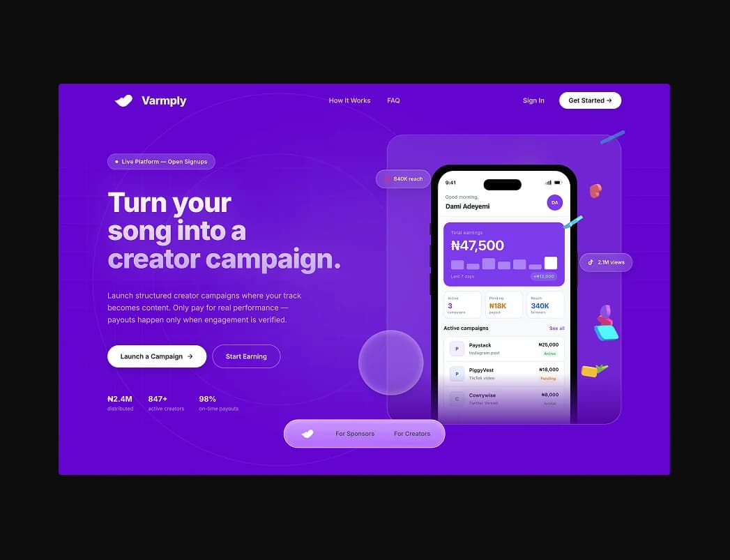
Two front doors. One brand.
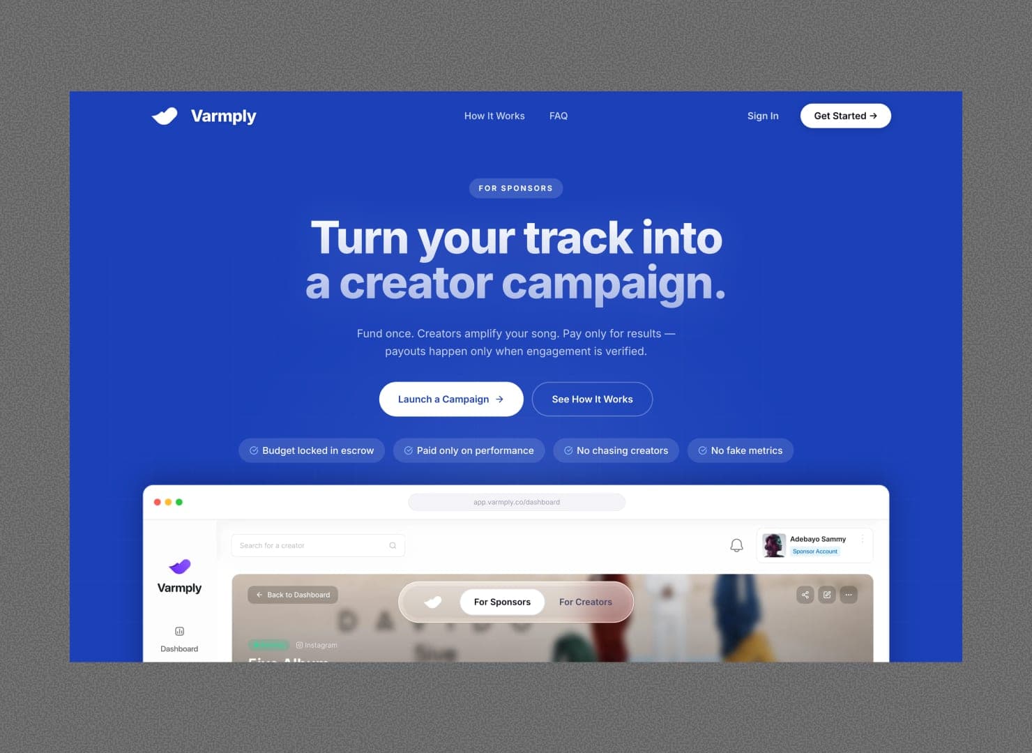
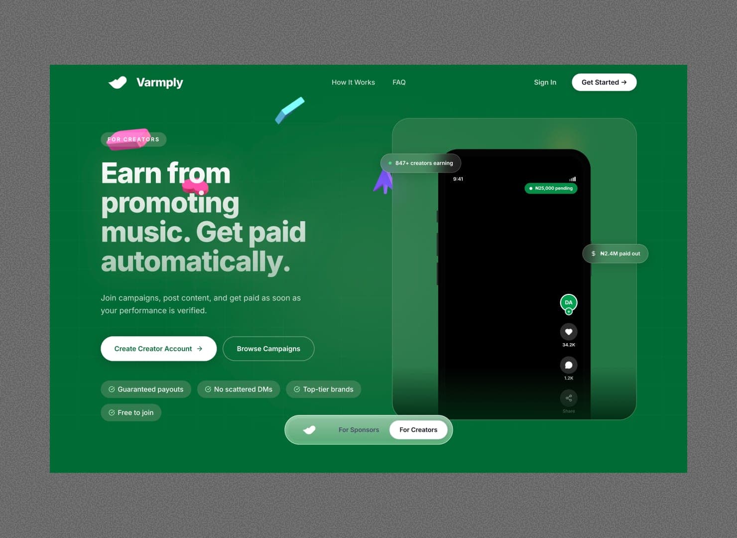
Most B2C marketing sites have one audience. Varmply has two: creators and sponsors, with fundamentally different motivations, different concerns, and different conversion triggers. A creator landing on the homepage needs to feel: 'my payouts are guaranteed.' A sponsor needs to feel: 'I'm in control and accountable results are guaranteed.'
The challenge wasn't just writing two sets of copy. It was architecting a site where both audiences could find their own front door, follow their own path, and never feel like the other side was getting the better deal.
Design system first. Pages second.
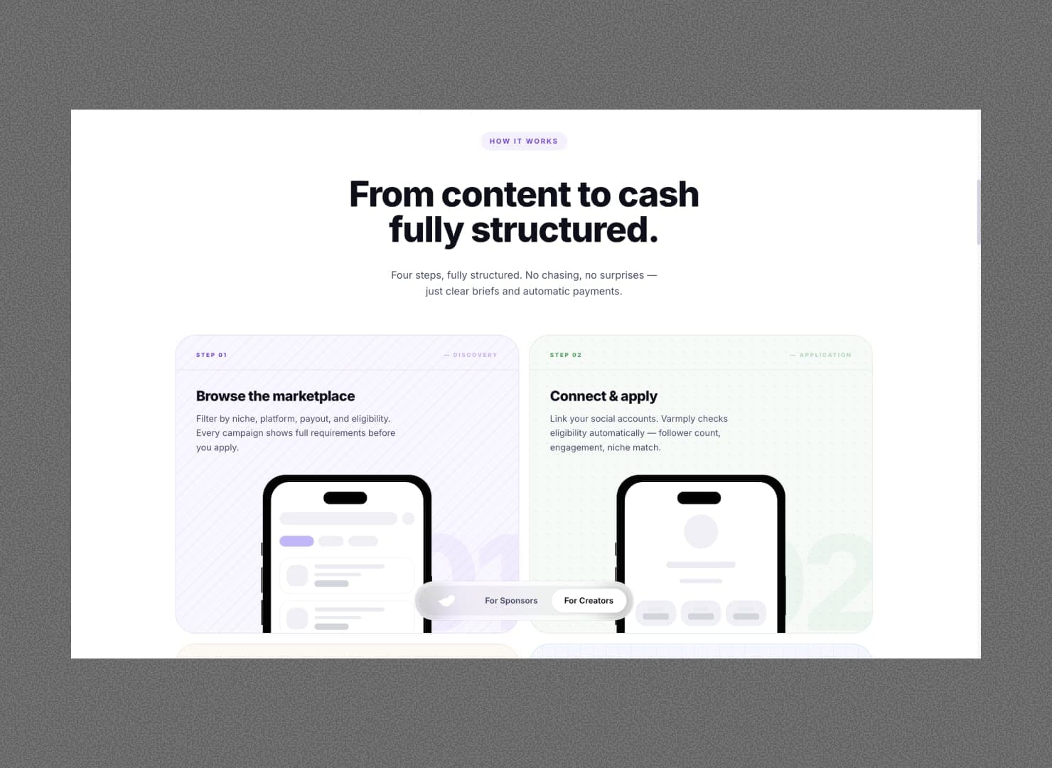
Dual-audience architecture
We mapped both conversion paths before touching design: what does a creator need to feel before signing up? What does a sponsor need to see before launching a campaign? The answer was separate landing pages (/creators, /sponsors) with a shared homepage that orients both, and a global audience switcher that makes navigation frictionless.
Editorial card system
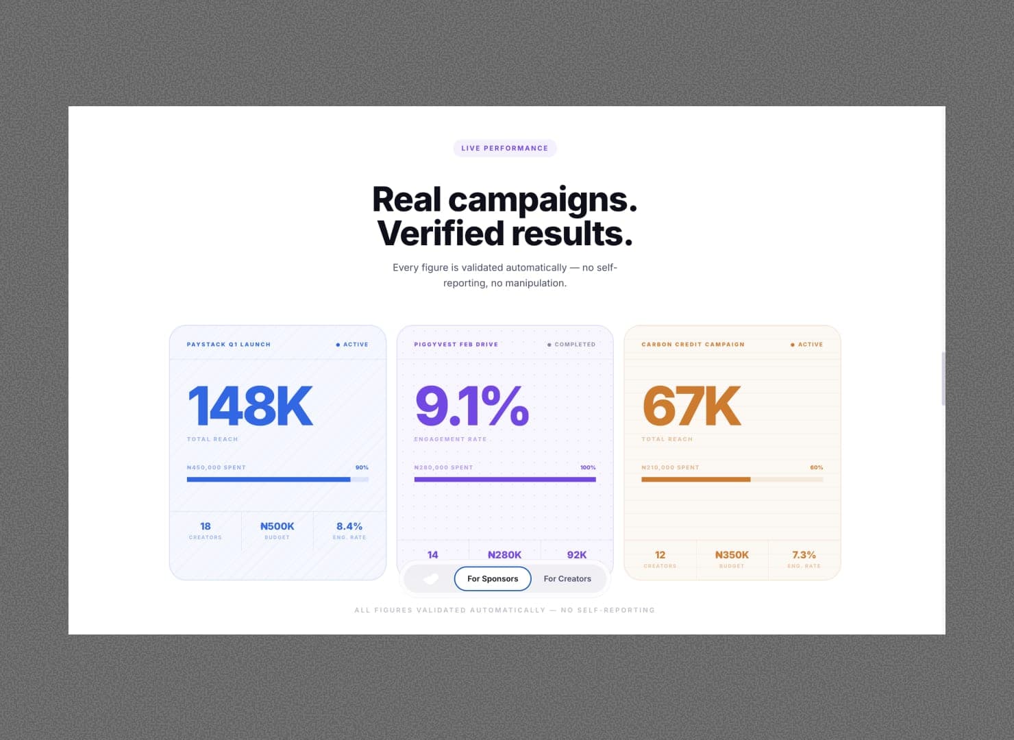
Varmply's product has four distinct areas: campaign management, creator earnings, sponsor tools, and payment safety. We gave each a colour (purple, green, amber, blue), a background pattern, and a consistent editorial card format. Complex platform logic explained through visual consistency, no walls of text required.
Motion and dimension
The hero needed to earn attention. Custom Three.js scenes for the homepage and creators page, GSAP for precise micro-animations, Framer Motion for scroll-reveal throughout, and Lenis smooth scroll tying it all together. The motion wasn't decorative. It was doing product communication work.
Build and performance
Next.js 16, React 19, Tailwind CSS 4. Mobile-first from the first component, fluid typography with clamp() across every heading, and full responsiveness down to 320px. The codebase is clean enough for the client team to update content without the site starting to drift.
Every screen had a job to do.
The visual system was the product communication strategy. Each page, each section, each card, designed to do a specific job for a specific audience.
A design system that does the selling.
Varmply launched with a site that could hold two audiences in one brand without diluting either. The editorial card system became a template the team uses for new product announcements. The audience switcher reduced bounce rate by making it immediately clear the site had something for you, specifically.
“We had a complex product to explain to two very different audiences. V1 built a site where both feel like it was made for them. The design system made that possible without doubling the work.”
Varmply Founder
Varmply
Next project
SpoonFi: Chain-Abstracted Staking